
So many of you have emailed me to ask about the paint colour
that we used in the split-bedroom that I thought I'd put together another
Farrow and Ball Paint Case Study just for you!
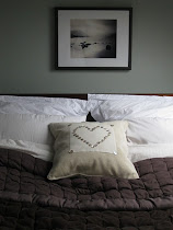
We first painted this bedroom for our gorgeously newborn boy/girl twins
so I wanted a colour that seemed girlie AND masculine at the same time.
 |
| Farrow and Ball Hay |
Farrow and Ball's Hay was the perfect choice.
 |
| Farrow and Ball Hay |
But, before we get going, have you checked out my other Farrow and Ball Case Studies? Just click on the links to have a peep...
While it's all very well gazing at gorgeously put-together magazine shots of Farrow and Ball paint colours, very often they are colour-adjusted so that what you imagine will be a gently dirtied cream is actually a strong mint green {yes, that's happened to me..}. To avoid such a catastrophe coming your way, I put together my case studies using both collated images AND photos from my own home from different times of day and under different lighting conditions so that you can see EXACTLY the colours you truly love.
 |
| Farrow and Ball Hay |
For example, here is the same part of the bedroom showing how Farrow and Ball Hay can change under different lighting conditions:
 |
| Farrow and Ball Hay under strong midday sunlight... |
 |
| ...on an overcast morning... |
 |
| ...and with fading evening light. |
Ours is a south-east facing room so it gets warm light much of the day but when Farrow and Ball's Hay is used on north-facing walls, it takes on a greener hue:
 |
| Farrow and Ball Hay front door |
Farrow and Ball describe Hay as 'a bright but not excessively hot yellow', which I'd say is bang on. There's nothing citrussy going on with this colour.
 |
| Farrow and Ball Hay |
Although Hay is quite a strong colour, it also has a lovely mellow quality, which prevents it from seeming over-whelming.
I love it!
Do you?


Images via: Misi, Bryella, Ocean Bathrooms, mine, mine, mine, Vintage Heart Duckumu


20 comments :
Hmmm...possible backdoor colour...hmmmm...
Oooh, back door colour...I like it!!
Sxx
Yes I do love it. I have used similar colours from Benjamin Moore and been very happy living with them.
Now I get it... For some reason I always assumed your twins were two boys, so I didn't understand when you said the new bedroom would be the girlS'.
I love your study cases... I'm beginning to paint samples for my future kitchen walls... And I find it so much fun!
I'm so glad you like them - I LOVE putting them together!!
I always say that buying sample pots should come with a health warning - it can be so hit and miss - so I hope this helps!!
Sarahx
You are a great teacher, Sarah.
Soon ... a new wee baby will be enjoying the paint colors in your home.
I know, I know...only three and a half days to my due date. Eeeek! Sxx
I love these case studies you have done! It's so true that colors can look so different depending on the lighting and picture. This is a beautiful color!
I have had a similar shade of that in most of the houses that I have lived in over the last 15 years. It was very easy to live with and I could put so many different colors with it. I treated it like a neutral and LOVED it.
Hugs, Cindy
I like how it changes personalities. :)
Bonito como todo lo que Haces.Paz y amor
What wonderful tips and love the color...easy on the eye.
Thought about
your paint posts,
today, as we had the
vaulted ceiling in our
bedroom painted
blue! It most definitely
changes intensity
with the light, as
you mention. We
are on the second
level, above the trees,
and wanted to feel
like we were waking
up IN the trees, hence
the blue. "Hay" is
very cozy and I love
it on the door that
you featured!
Happy happy,
xo Suzanne
Benjamin Moore is always my "go-to" for paint color.... they do such a great job.
This is great to see on one page! I've used Farrow and Ball French Grey in every house I have lived in - and in every house it has looked like a different colour! Paula x
That is a beautiful colour! I used a slightly deeper version of it for the living room at our last house. It was called Baklava ;-) It makes sense that a yellow with slight green tones would be called "hay".
I really like this color. Muted and subtle, but sunny.
I love this yellow! I have something a smidge darker in my dining room and I absolutely adore it, even after seeing it for 5 years!
ECO-DECO Green Technology
Made in a single batch at a time in Dorset, England, Farrow & Ball’s eco friendly water based paint has developed the highest reputation for quality. What makes this paint unique is its traditional formula of raw materials. While other paint manufacturers moved to acrylic recipes comprised mostly of plastic, Farrow & Ball kept its original procedure of natural ingredients like chalk, lime putty and China clay.
Greenller.co.uk
n
Post a Comment